7 TIPS TO DESIGN BETTER
CONFERENCE POSTERS
CONFERENCE POSTERS
Introduction
Earlier this month I had a wonderful time speaking to researchers about Data Visualisation at the CIISA 2022 Congress in Lisbon. It was also an opportunity to wander through the poster session and get to know more about the amazing research being done by Masters and PhD students working across a multitude of fields – from Biomedical Sciences to Animal Production.
In my opinion, one of the mains issues with scientific education is the fact that researchers are mostly taught to do science, but not how to communicate it. Based on the most common mistakes I saw, I decided to write down a quick list with seven tips to design better conference posters.
Updated Nov 2022
"[...] researchers are mostly taught to do science,
but not how to communicate it."
but not how to communicate it."
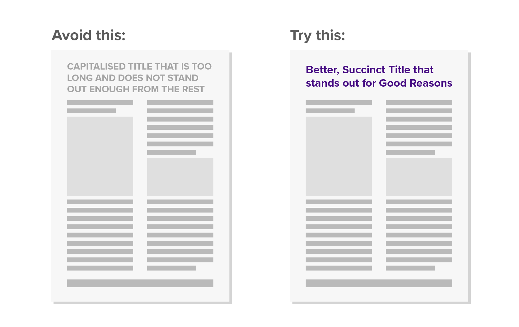
1. Hit the Headlines
One thing I feel most scientists forget is that, even though you are passionate about your research topic, most people are not. You have a very short window of time to grab your audience's attention and convince them about how important your research topic is. What can you do?
• Start with an interesting, informative title summarising your specific research topic, or a main finding.
• Make the title stand out in large, bold, coloured text.
• Avoid UPPER CASE as it gets harder to read.
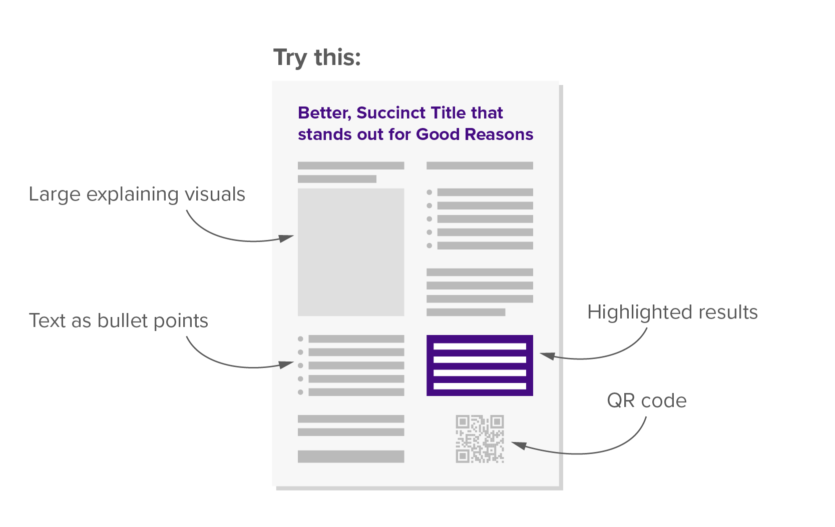
2. Less is More
Most posters designs are too ambitious as you often want to show every single detail. Remember that, when faced with too much data, audiences unfamiliar with your research topic will feel overwhelmed and discouraged to read more. Think of your poster as a business card, and give viewers just a first introduction to your work.
• Keep content text concise and easy to understand. If you have a lot of things to say, consider including less relevant information behind a QR Code link.
• Bullet points are easier to read than full paragraphs.
• Body text should be at least 24 pt. Give it a try and print some drafts to check whether your title and body text can be read from a reasonable distance.
• If anything can be explained visually, do it.
• Clearly highlight your results. For example, if your poster background is light, use a dark background for the results section with white, larger text that stands out against the remaining content. Use the opposite approach if you have a dark poster background.
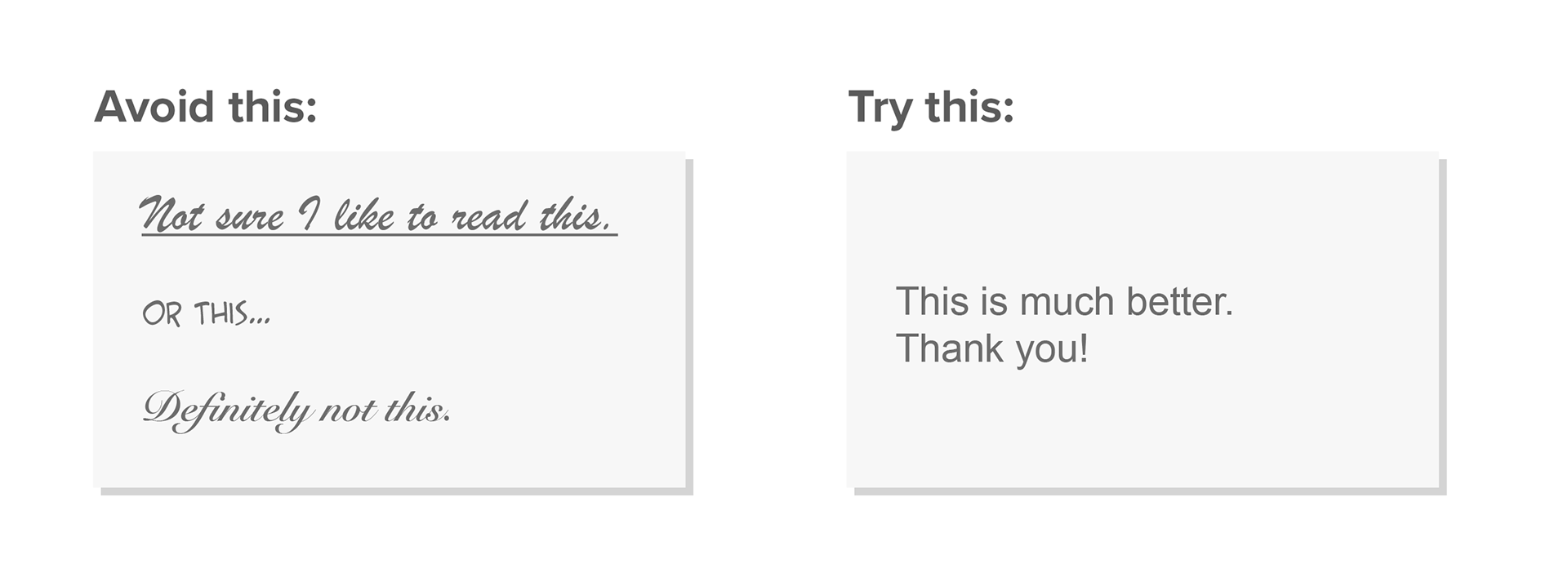
3. Get Off on the Right Font
Typography deserves a special mention here. It may seem just a matter of taste, but in reality a lot of research goes into creating readable and beautiful fonts. Make sure to choose them wisely:
• Avoid more than two typefaces per poster. Sans serif fonts are easier to read – Arial, Verdana, Tahoma or Opens Sans are all great options, but make sure you check the poster guidelines to see if they recommend a specific one.
• Use different, yet consistent text sizes and weights (e.g. regular/light/bold) to create hierarchy.
• Avoid complicated fonts, italics or underlined text to emphasise content, as this formats are trickier to read, especially for people with dyslexia.
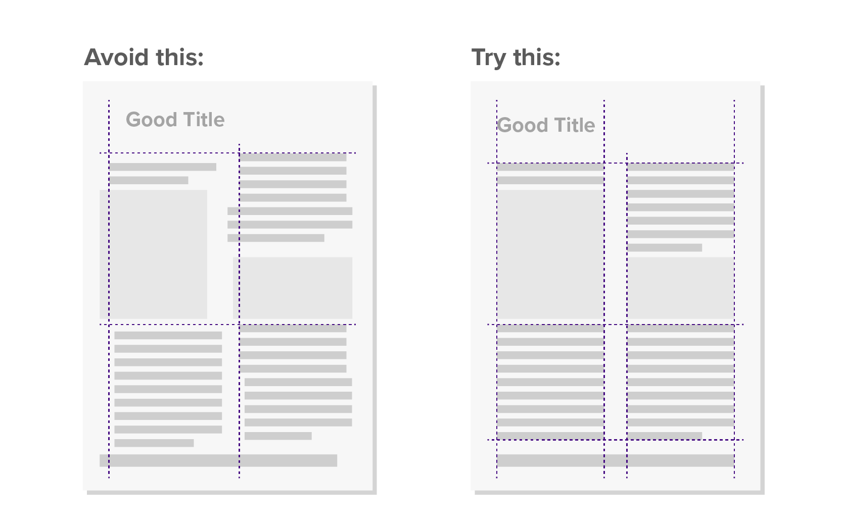
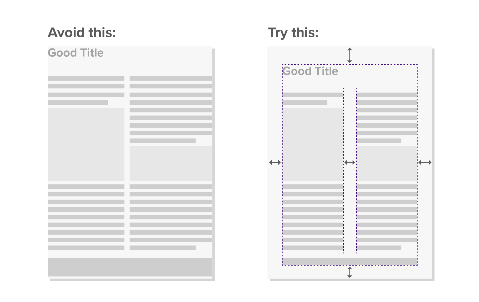
4. Draw a Line in the Sand
Use an invisible grid to visually organise all elements on the page (e.g. vertically and horizontally align text boxes.). It can be very subtle but it makes all the difference.
5. Don’t Lose by a Narrow Margin
When you read a poster, negative space is as important as space with text and visuals. Optimize your layout with the following tips:
• Make sure you set a margin of at least 2 cm between your content and the edge of the poster. Margins are essential to avoid having content looking like falling off page.
• Consider setting your text in columns, make sure the gutter (space between columns) is wide enough for a clear separation between different elements/sections.
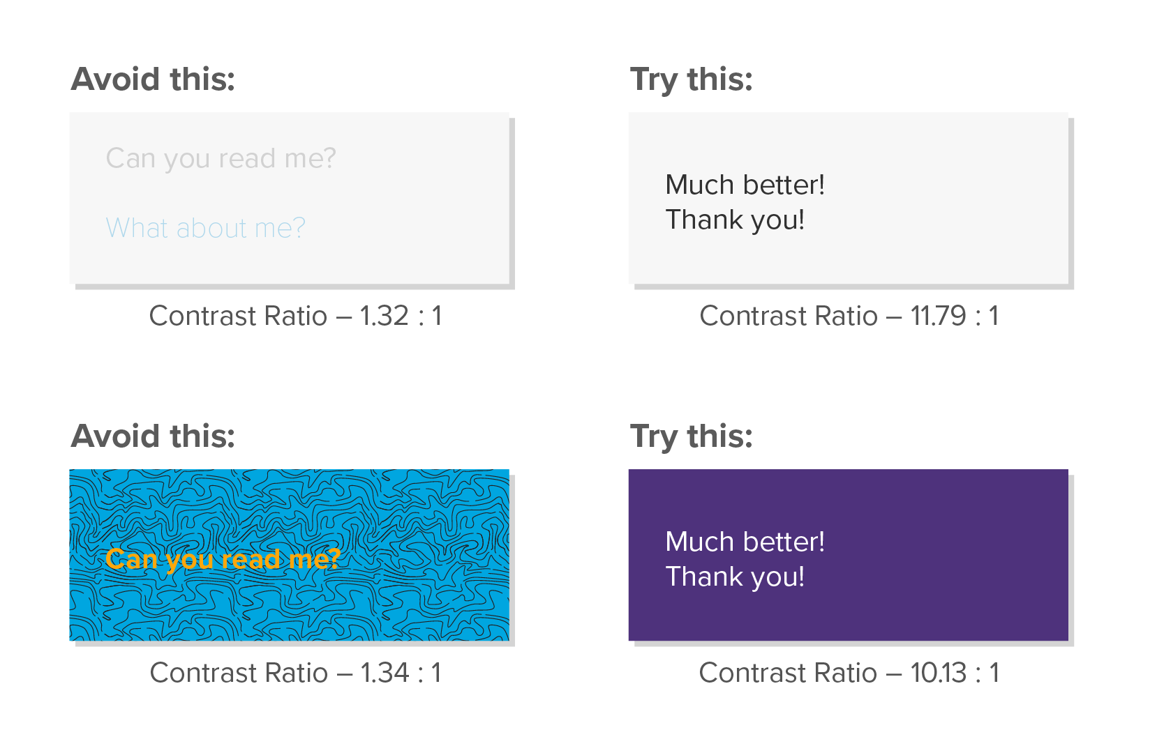
6. Don’t Fade into the Background
One of the most common mistakes in poster design is using busy backgrounds that do not allow text and other visuals to stand out. Here’s how to avoid this:
• Never use a photo or pattern, even if faded, as a background.
• Be mindful when using background colors other than white. If you do so, make sure the text has enough contrast, so that we can still distinguish the outlines of the letters. WebAIM’s Contrast Checker is a great resource to test if the contrast between text and background is safe for different viewers. While this tool is mostly relevant for digital content, it is still worth it using it for printed materials as well.
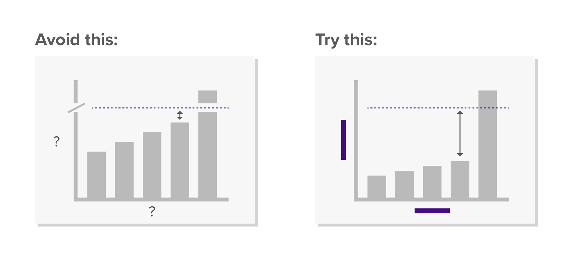
7. Label Graphs, not People
Finally, let’s speak a bit about graphs in scientific posters:
• Properly–labelled axes are fundamental in every chart. Make sure you include what is being measured, the units, and explain what errors bars you are using (e.g. Confidence Interval, Standard Error or Standard Deviation).
• Never truncate the y-axis in bar charts, as this distorts the data, creating a false sense of difference between bars.
• Make sure you use the right graph for the right data. Check the platforms From Data to Viz, or The Data Visualisation Catalogue, to learn more about different charts types.
Learning More...
I hope you find all of these tips useful! In the end, this is all a matter of competitiveness. You want to make sure your great work gets proper attention, so you have to make it stand out for all the right reasons.
If you are interested in learning more about scientific visual communication – from creating posters and presentations, to designing effective charts, – have a look at some of my workshops and trainings below. Good luck with your designs and reach out if you have any questions!
© Diogo Guerra. 2022