PROJECT
During 2021–2022 I engaged on a personal Twitter project hoping to deepen my knowledge and experience with the fascinating field of data visualization. I had been designing graphics and dataviz for quite some time, while working at a medcomms agency. There we often guided clients on how to best present their data in engaging and clear ways. However, now I wanted to experiment with different tools, graph types and presentations.
I was inspired by Mesa Schumacher's year long project Animalia, where she drew one different animal per day during 2021. I decided to create daily color palettes based on her illustrations, and then every four weeks I designed summary visualizations of that data. What started as an inspired online collaboration, evolved into a great learning project with, I dare say, pretty interesting results.
In 2022, the work "365 Days of Color and Dataviz" was longlisted under the Category "Unsual" at the Information is Beautiful Awards, organized by the Data Visualization Society. Read more here
Full project on my Twitter page.
© Diogo Guerra. 2021-2022
TOOLS
Adobe Illustrator
Flourish.studio
RAWgraphs
Datawrapper
Microsoft Excel
Adobe Kuler
TOPICS
#Dataviz #Color
#Scicomm
#Sciart
#Infographics
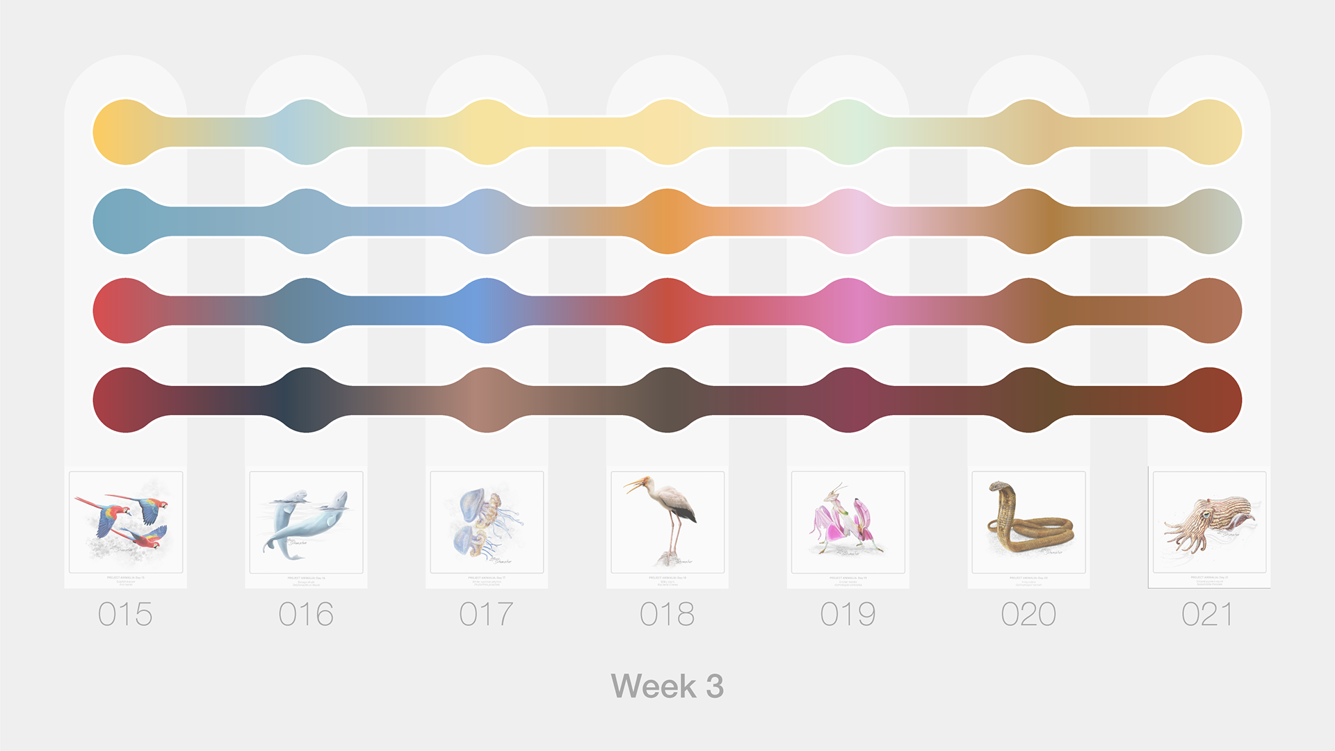
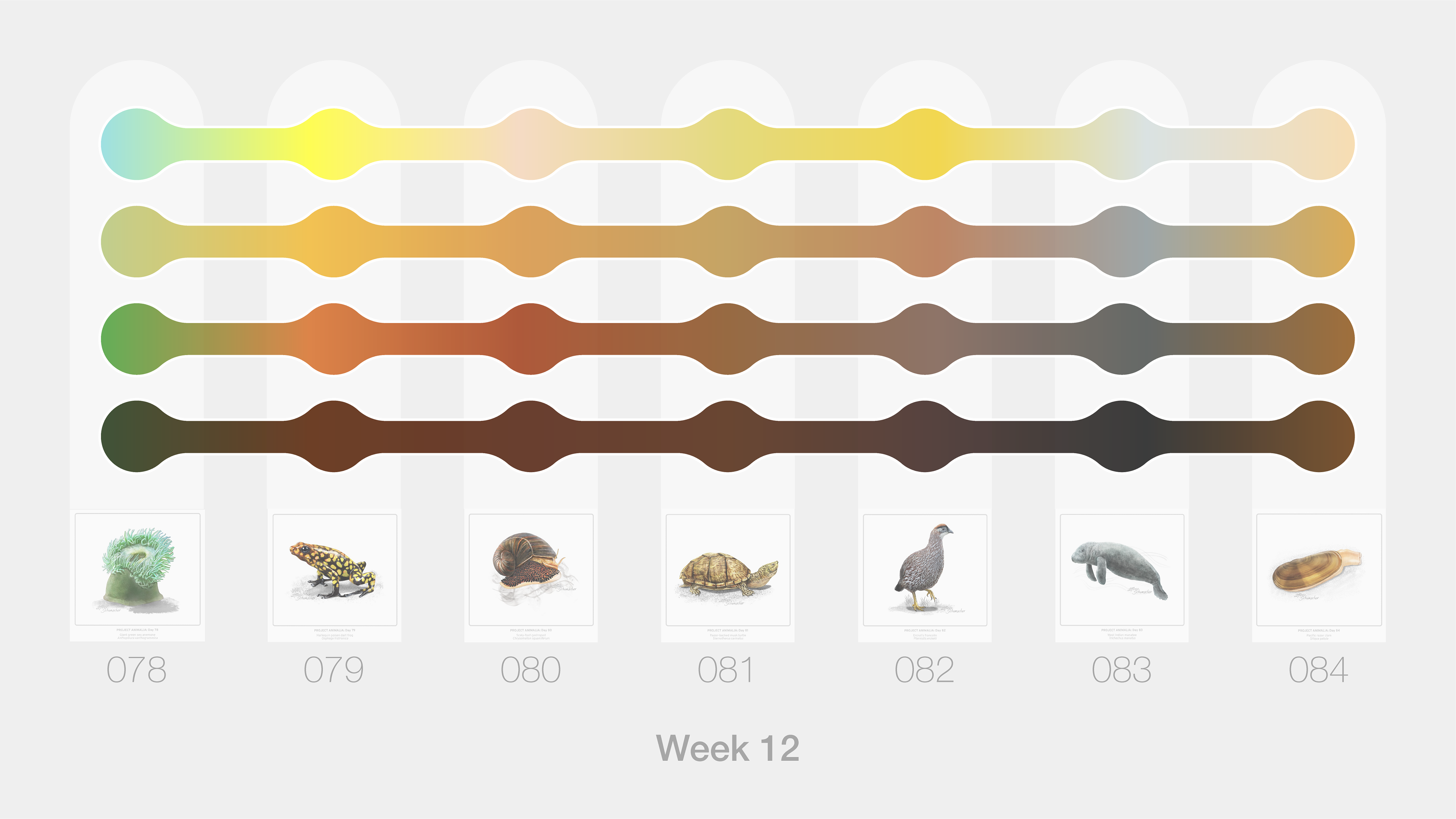
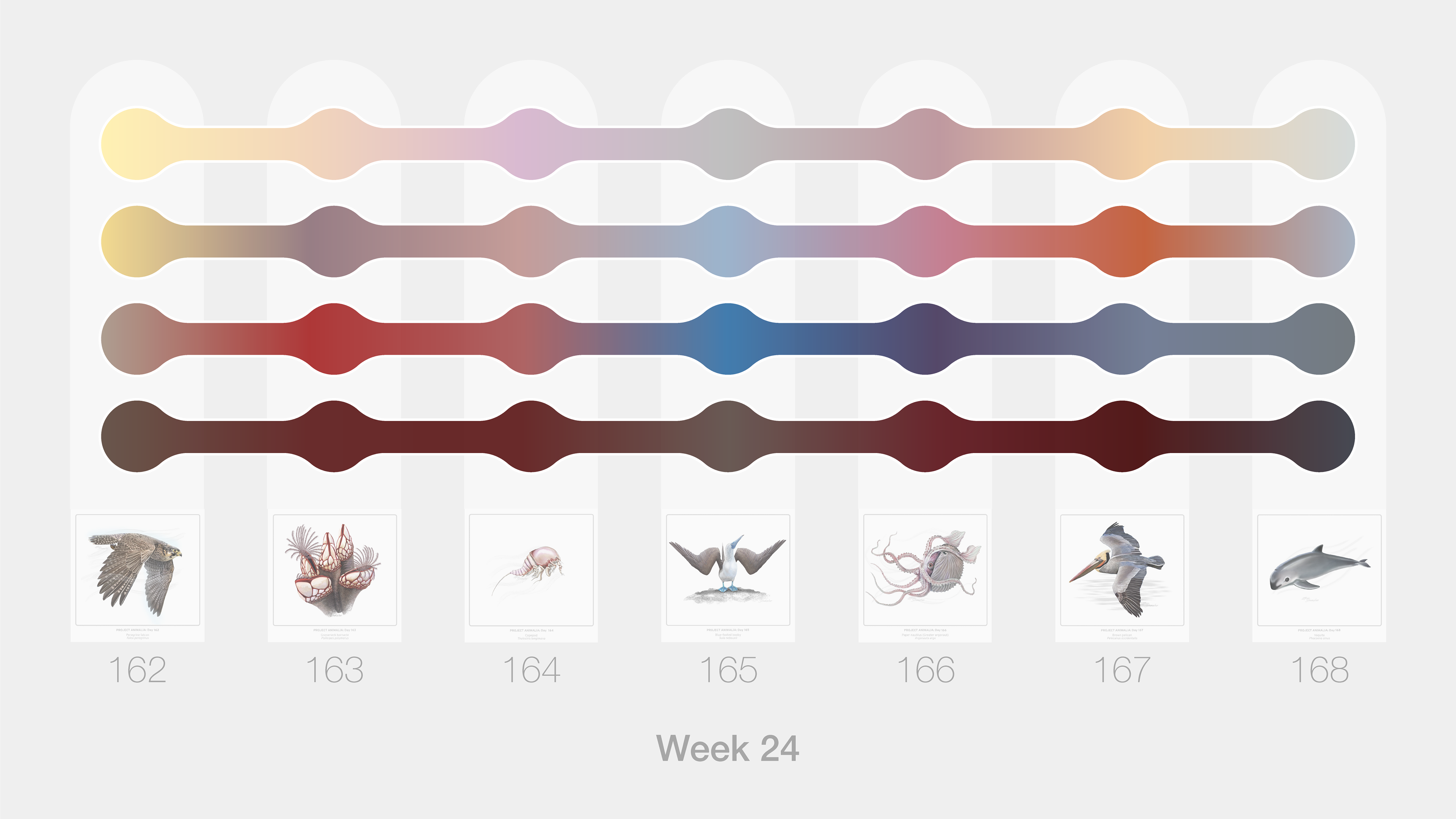
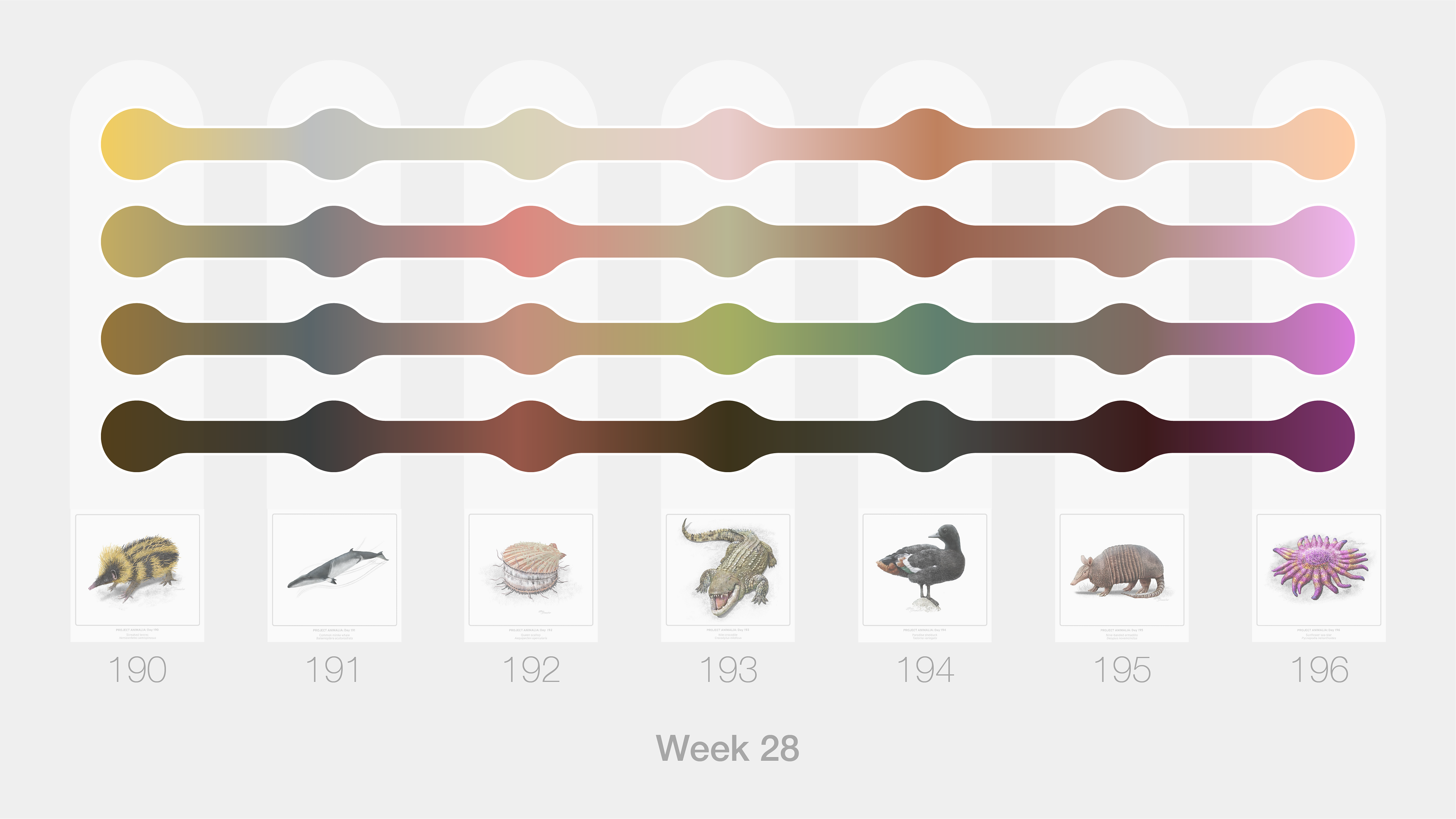
/ Examples of weekly color palettes entries. For each day, I used Adobe Kuler to create and refine 4-part color palettes based on Mesa's daily animal art. The Hex Code, RGB and HSL values were compiled in a long dataset, which was used to create the data visualizations below.
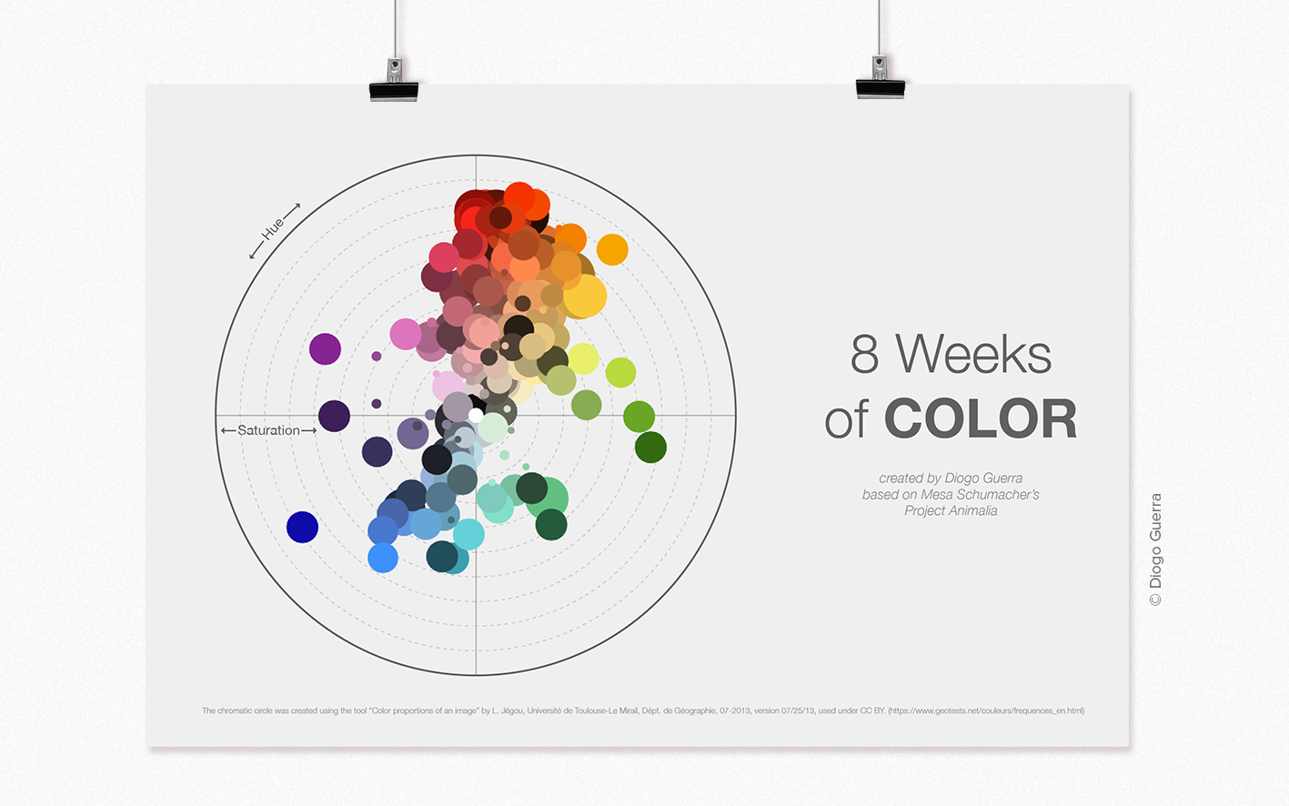
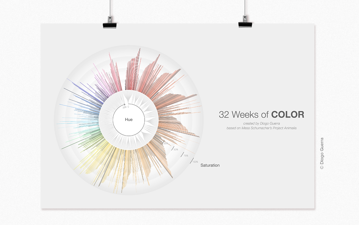
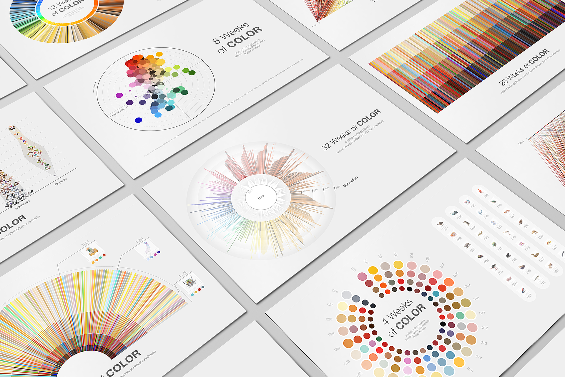
/ I wanted to get a sense of which colors were being used the most. This chromatic circle describes the color proportions of all color codes collected during the first 8 weeks (224 entries at this point), organizing each point by hue and saturation. I've used an amazing online tool designed by Laurent Jégou, where one can obtain color proportions of any image. Check it here.
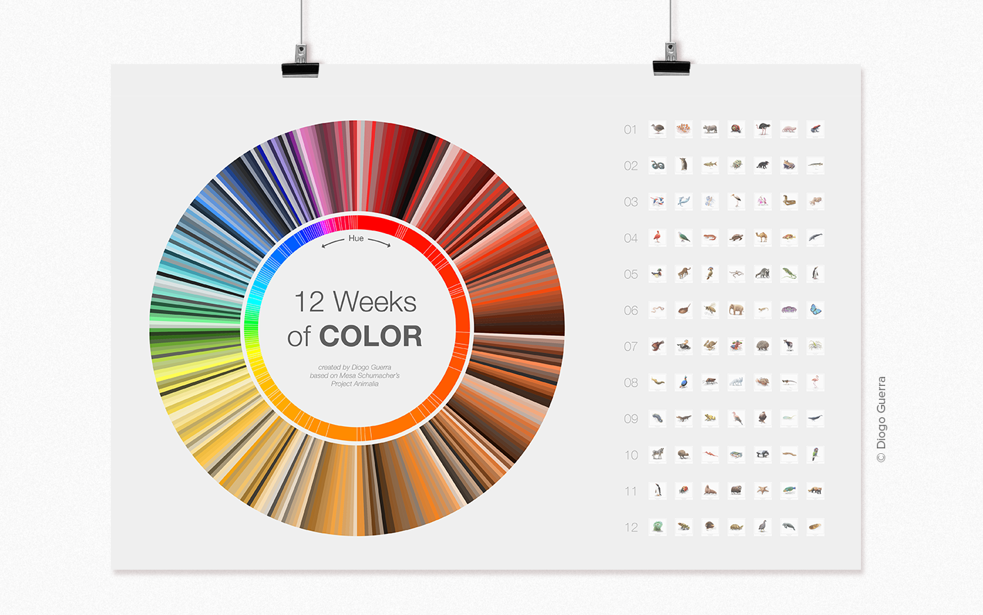
/ For this piece, I wanted to properly organize all the color codes. Therefore, I used Flourish and Adobe Illustrator to visualize all 336 HSL color codes in a sunburst plot. Entries were organized by hue & then by lightness within each hue. It was clear that a lot of warm tones were being used. On the right side you can see the list of all the illustrations Mesa Schumacher had created at this point, from which the color palettes were retrieved.
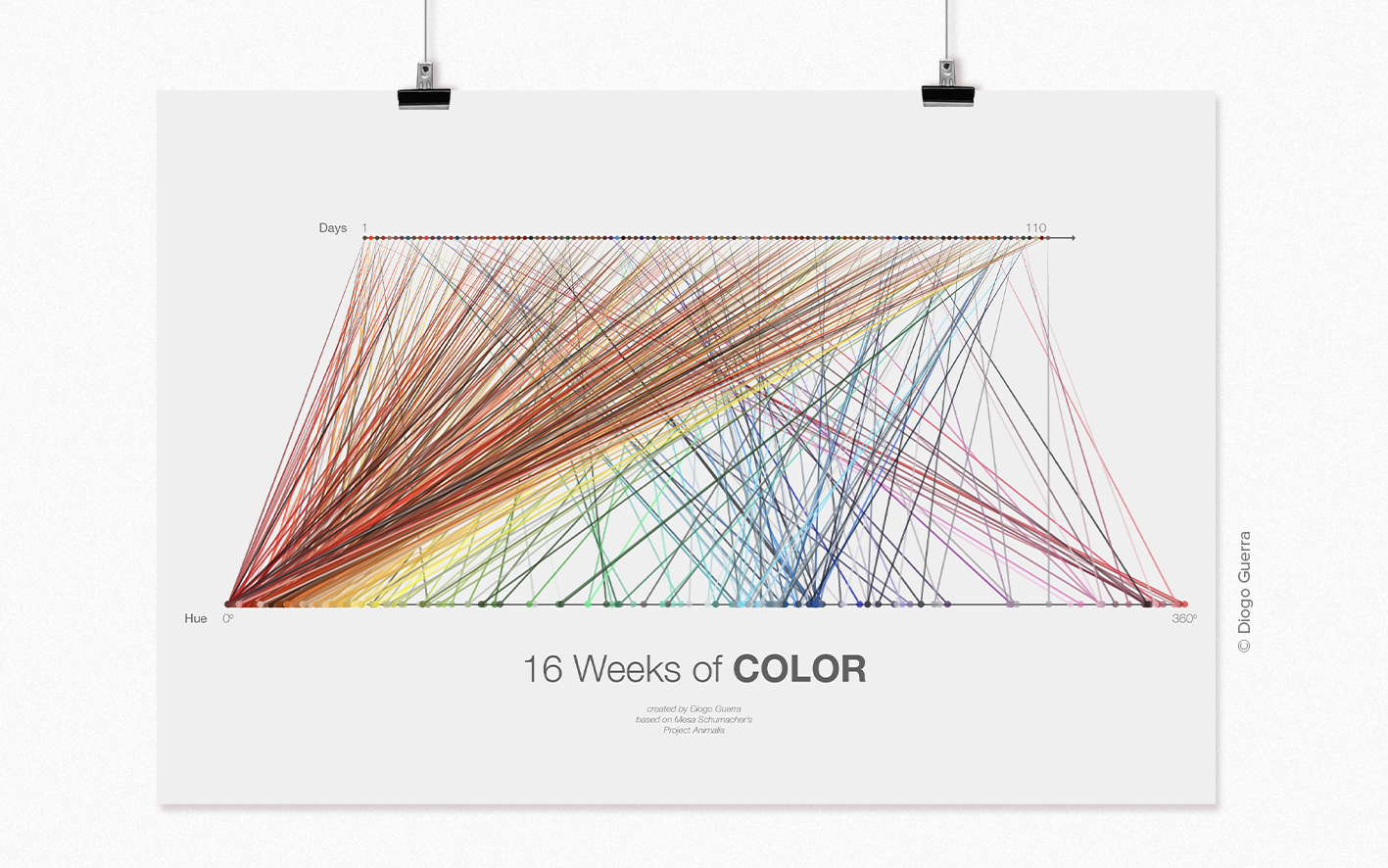
/ I was exploring different ways of showing which hues were being used the most in the color palettes. For week 16, I have once again used Flourish and Adobe Illustrator to create a rather intriguing loom-like slope chart, linking each daily color with its respective hue value. One can appreciate how skewed the lines are, mostly converging to low hue values (reds and oranges)
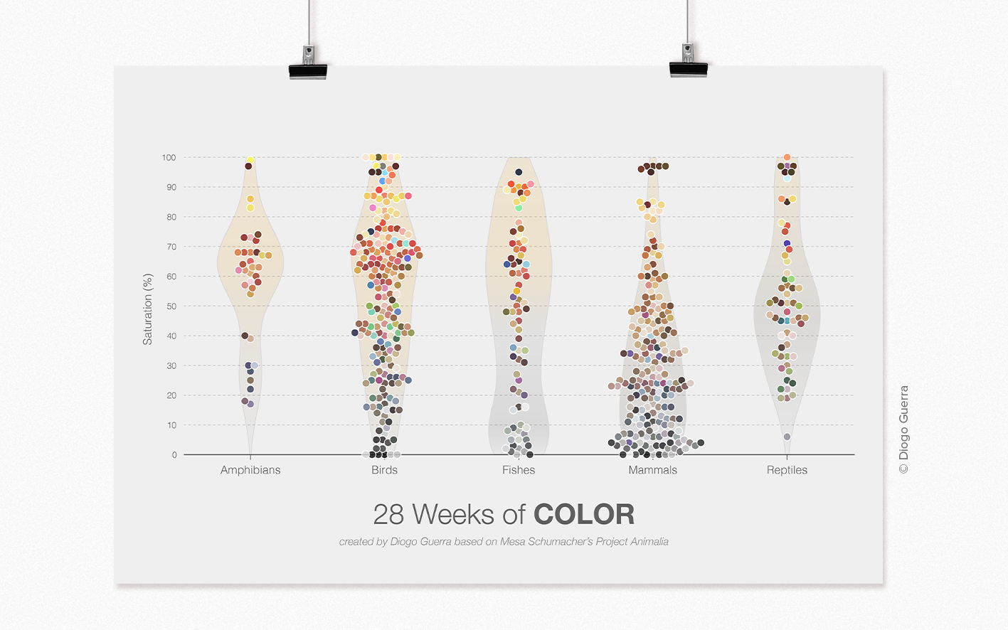
/ Which taxonomic groups display the richest color palettes? To answer this question, I've created violin plots with jitter, plotting all 784 entries according to their color saturation (%), grouped by taxonomic group. For the sake of simplicity, taxonomic groups with few entries were not included. The result? It indeed feels like mammals are that one grey-dressed introverted dude, while amphibans and birds are some truly fashion-forward party animals.
/ This time I wanted to get a visual representation of how the different hex codes were distributed by hue and saturation levels. I've used Flourish to organize hues in a radial tree plot, coupled with a column chart displaying saturation levels of each code. I must say the visual result was quite fascinating to look at.
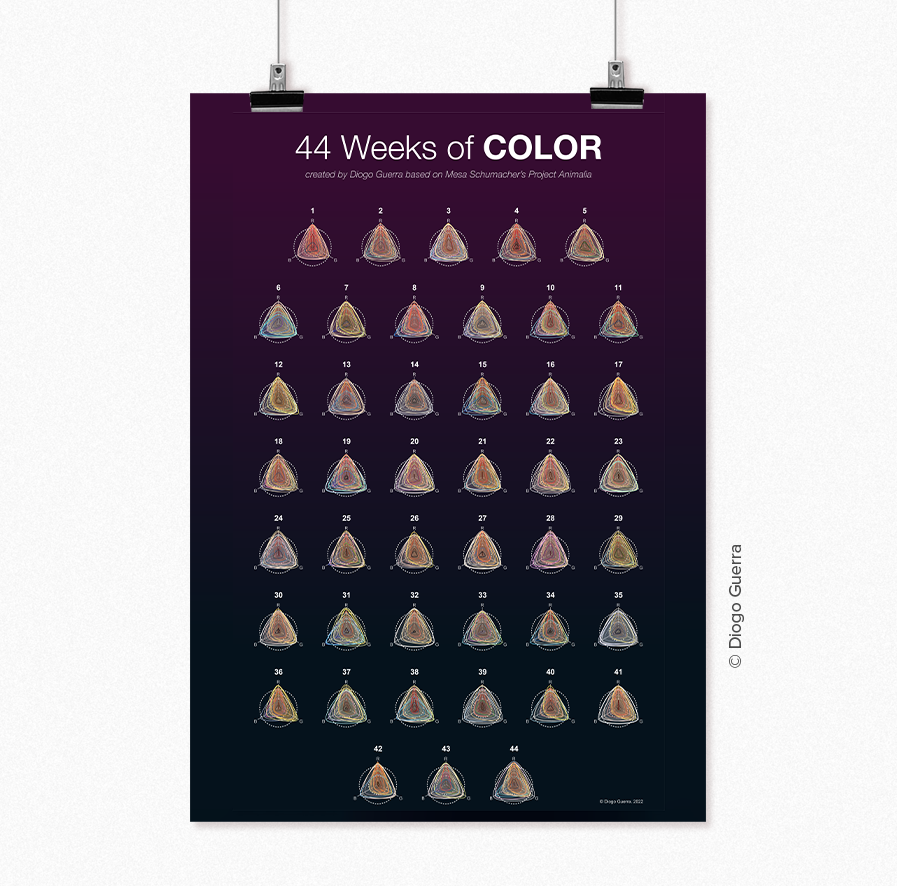
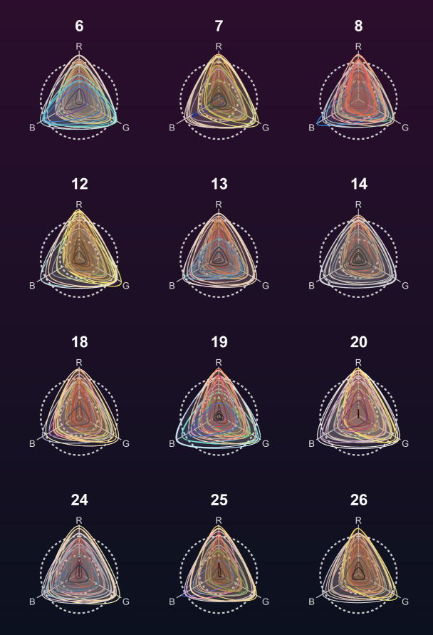
/ For week 44, I wanted to create a different type of chronological organization of the data. I've created weekly radar charts, whose triangular silhouette would reflect the RGB values of all 28 color codes present each week. The result is a color calendar, where we get a glimpse of the color profile of each week.
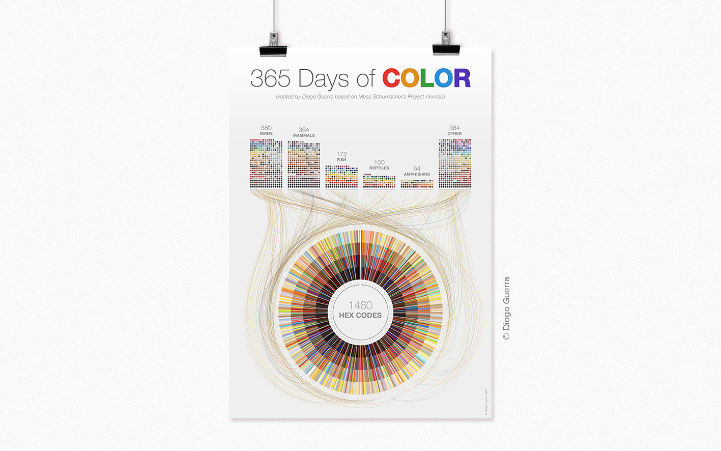
/ This is the final visual summary of the project. A top pictogram chart breaks down the number of entries and codes for each main taxonomic group. I wanted to link this first chart with another way of organizing the data – in a sunburst plot representing the yearly, cyclic calendar with all 365 days, weeks and color palettes (organized from darker to lighter tones).
© Diogo Guerra. 2022